Subject Key Points:
Documentation:
Contextualisation:
Field Key Points:
Contextualisation:
Documentation:
Subject Key Points:
Documentation:
Contextualisation:
Field Key Points:
Contextualisation:
Documentation:
Documentation:
Contextualisation:


When I first started exploring with how to display my quotes I originally tried stamping, however after a few tries I decided to try something different as it is a bit too messy.


This is my second attempt at trying to display my quotes in an interesting and effective way. I liked this a lot more and it is what made me start thinking about using off-white paper and capital letters, which I eventually used in my degree show exhibition.


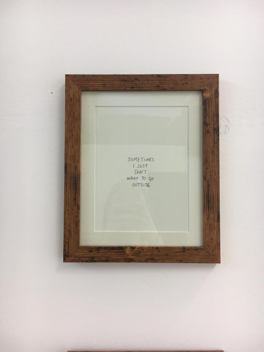
After I had more or less decided what style I wanted for my quotes I thought I would see what frames I wanted to use; I tried black and silver, then a light wooden colour however finally settled on a rustic wooden frame and off-white, textured paper for my degree show.


Throughout this year so far, and previous sketchbooks, I have been looking in to simplistic styled life drawings in order to help my creative flow as well as exploring what flaws people believe that they have. Instead of hiding these flaws and insecurities, I however wanted to celebrate them in my drawings as well as my photographs on body image. I have been using watercolours, ink and pen- recently playing around with colour to see if I can bring a bit more life in to my work.


Seeing as I have been doing a lot of messy, line drawing styled life drawing I thought that I would merge my drawings with my photographs. Therefore I printed some of my body image photographs as well as hand photographs, varying the two body image insecurities between black and white and coloured edits. I wanted both black and white as well as coloured so that I could compare the outcomes. With these photographs I used white pen to outline the body parts photographed; using the same style as I have previously with my life drawings. I also used a tool to scratch into my photos to make them look a bit more rough. I also liked the idea of ripping under the photos- or peeling/ripping apart the insecurities.


I originally took portraits when looking in to body image as I wanted to capture peoples facial expressions, and compare them to the quotes that I had from them, however I then moved on to taking body image photographs.


")


These are some photographs that I have taken of peoples body parts that they have told me they are insecure of. I have continuously been exploring with taking photographs of specific, singular parts of the body whilst also keeping the identity of the person I am photographing anonymous. I started focussing on singular body parts because when I got my original quotes they were the most common and rather than hiding these parts of their bodies I wanted them to be celebrated.


Whilst at home I took some more developmental photographs as I wanted more photos to choose from in my exhibition. I then decided that I would choose the best out of these photos and edit them.


These are the photographs that I have edited and that I am thinking about using in my degree show. I couldn’t decide between some of the more similar photographs, therefore I plan to print them all out on to photo paper so I can see which photos work best together. I also need to go through my past photos that I have taken this year to see if any of them are suitable for my exhibition- however I can’t choose too many as I want between 10 and 15 different photographs and quotes.


After doing my developmental photographs I wanted to take some body image photographs in the photography studio with a proper white backdrop and lighting. The following photos are the ones taken here, however not yet edited. These photos are my unedited pieces taken after asking about peoples insecurities. I wanted to take some photographs in the studio as they are better quality and the edits will be clearer on account of the better lighting. I am quite pleased with these outcomes so far, as they really delve into the peoples insecurities that I photographed- however when looking at the photos there is a level of grace and beauty to these so-called imperfections.


My edited photographs.
The one thing all of these edits made me realise was that I definitely wanted my photos to be in black and white.
I then did the Missoula exhibition in order to decide which photos to use in my degree show exhibition.


When I visited this exhibition in London it made me realise how I wanted to display my own work in exhibitions and normal practice. This piece really intrigued me; as the layout was simplistic and neat yet all of the single art pieces on the wall were unique to themselves. I also liked how you have to walk along the whole piece looking at each individual artwork, yet when you step back the whole of it is an artwork in itself.
This is where I first realised what style of work I wanted to do and is what has influenced me in my whole practice throughout third year.
Contextualisation:
Documentation:
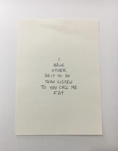
I bought some off-white textured paper to write my quotes on; I cut the paper to size and then measured out where the halfway point was so that I could write the quotes in the centre of the paper. This also shows the style in which I decided to write my quotes in.

This is a close up of how I displayed my quotes in my frames that I got; I chose a dark, rustic wood for the frames as I liked how it wasn’t as neat and tidy as some others and I found this frame a lot more interesting. The inside border in the frame also works well with the off-white paper containing the quote.


These are all 6 of my frames up in my degree show; after my artist research I decided on the simplistic layout for the frames- all the same size, same frame, level with one another with the quotes positioned in the same place.
I was quite pleased overall with how my degree show turned out, as well as how my photos looked- as I thought they were quite bold and striking to the viewer. Therefore I was thinking about a way in which to encapsulate the essence of my exhibition, yet in a different form.
That is when I started thinking about creating a book with one of my photographs on the left page, and then facing the photo on the right page would be a quote from that person. I am going to pursue this over summer, as well as take more photographs, so I do not lose my interest in art after University.
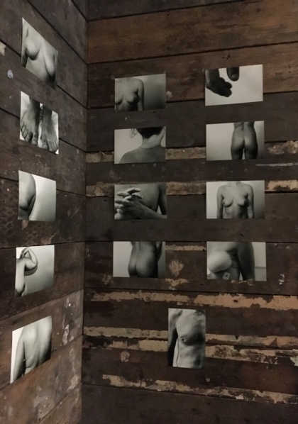
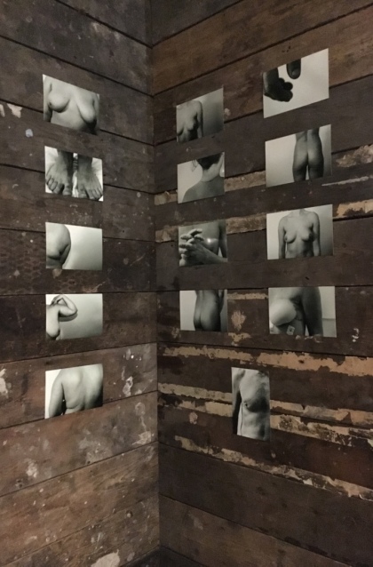
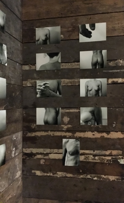
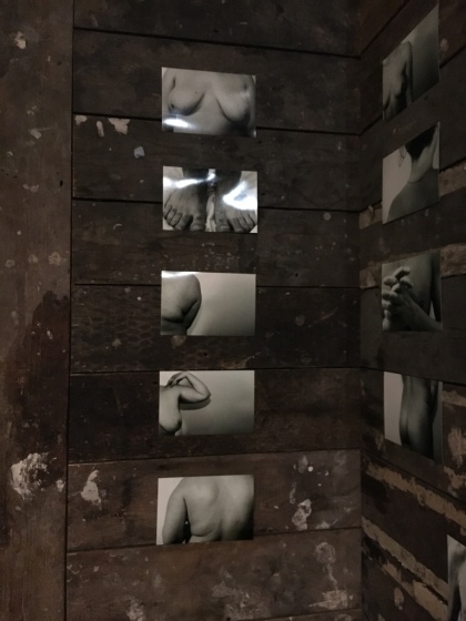
I chose to do another exhibition at Missoula because I particularly liked the wood panelled background as well as the corner section of the room I displayed in. I used the latest photos that I have taken and edited, as well as the ones I plan on using in my exhibition. I used 14 edited photos in this exhibition; 6×4″ in size. I chose to use more photos in a smaller size because my quotes are not yet complete therefore I can’t display them. It also gave me a better idea as to how to display my photographs as well as what order to put my photos in.
Throughout my artistic practice I have used photography to get a greater understanding of peoples insecurities about their bodies. In my photographs I have been focussing on singular body parts that people have told me they are most self conscious of. To get a deeper appreciation of the insecurities that people have about themselves I have also been asking for quotes on what they are most insecure about, as well as the reasoning behind it, and trying to find creative ways in which to display these feelings and thoughts about themselves.
I have been looking in to peoples insecurities as I find it interesting how people view themselves in such a negative way; as well as how these body image problems affect them in their everyday lives. I have been using photography as a medium to show that these flaws that people think they have should be celebrated rather than hidden, yet still keeping the people photographed anonymous in order to make them more comfortable.
Throughout my whole artistic practice I have focussed on body image issues; throughout my sketchbooks containing life drawings as well as photos. It is important to me that we strive to help people accept and love their bodies, and the way I have chosen to do this is by photographing their bodies that they are most insecure about in an attempt to show them that they should love these parts of themselves as they make them who they are.


I chose this select few photographs from my edited photo collection and thought that I would test how they looked in an exhibition space; as I have done before.


I chose to do another exhibition at Missoula because I particularly liked the wood panelled background as well as the corner section of the room I displayed in. I used the latest photos that I have taken and edited, as well as the ones I plan on using in my exhibition. I used 14 edited photos in this exhibition; 6×4″ in size. I chose to use more photos in a smaller size because my quotes are not yet complete therefore I can’t display them. It also gave me a better idea as to how to display my photographs as well as what order to put my photos in.


Then these are my final outcome in the degree show. I used black carpet tacks to secure each corner of each photo to the wall as I found that the rough black tacks went well with the black and white photos; and the fact that they are half sticking out of the wall, some of them bent, gives the imperfect, striking look I was going for in the theme of my work as well as the photos. I only used 8 photographs in my degree show, as I had another wall of frames along side my photos and I felt more photos would have been too much to take in for the viewer. As I have previously explored, I went with the simplistic layout, with the photos also being in line with the frames.
